S1
Rebuilding trust for a virtual therapy practice
A therapist’s directory profile was earning trust his own website couldn’t. This is the redesign that closed the gap — evidence first, credentials surfaced, rebuilt on a stack he owns.
Active Psychotherapy — Burnaby, BC · UX Strategy · Web Design · Next.js Rebuild
Client
Active Psychotherapy
Role
UX Strategy · Design & Build
Cost to run
~$0 / month
S2
The Problem
His website wasn’t winning clients. Psychology Today was.
Frazer Bucholtz is a Registered Clinical Counsellor running Active Psychotherapy, a virtual practice serving clients across BC and Canada. He’s warm, credentialed, and easy to talk to — and almost none of that came through his website. Inquiries arrived through Psychology Today, a third-party directory, while his own site quietly collected bounces.
He was paying premium Squarespace pricing for a template that could have belonged to any practice: credentials buried, areas of focus missing, no SEO foundation. The redesign had one job — make the website earn the trust his directory profile already did.
S3
Discovery · The Audit
The evidence was already in the analytics.
Before proposing anything, I read the Squarespace analytics and audited the site page by page. The case for a redesign didn’t need to be argued — it needed to be shown. Four findings did most of the work.
446
Pageviews · Jan–Jul 2026
64.5%
Avg. bounce rate
104s
Avg. time on page
Traffic without traction
75% bounce on /contactSessions arrived — and left. The Home page pulled 202 views, but only 86 continued to Contact — and three-quarters of those bounced immediately. The conversion moment (booking a free consult) was happening on his Psychology Today profile instead of his own site.
The tone mismatch
The copy promised a warm, compassionate, non-judgmental space. The template delivered a generic small-business layout that could have sold accounting services. For a first-time therapy client, that gap reads as untrustworthy.
Buried credibility
RCC registration, BCACC membership, directory verifications, and a much longer list of areas of focus all existed — just not on the website. The strongest trust signals a therapist has were invisible at the exact moment a visitor was deciding.
No foundation for search
Heading structure, page metadata, and copy gave search engines almost nothing to index. For local queries a prospective client would actually type, the practice effectively didn’t exist outside the directory.
S4
Before / After
Same practice, two very different first impressions.

- 1
Generic template hero — stock imagery, no sense of who the therapist is
- 2
Credentials and verifications absent above the fold
- 3
Areas of focus reduced to a short paragraph
- 4
No clear next step — the free consult was easy to miss
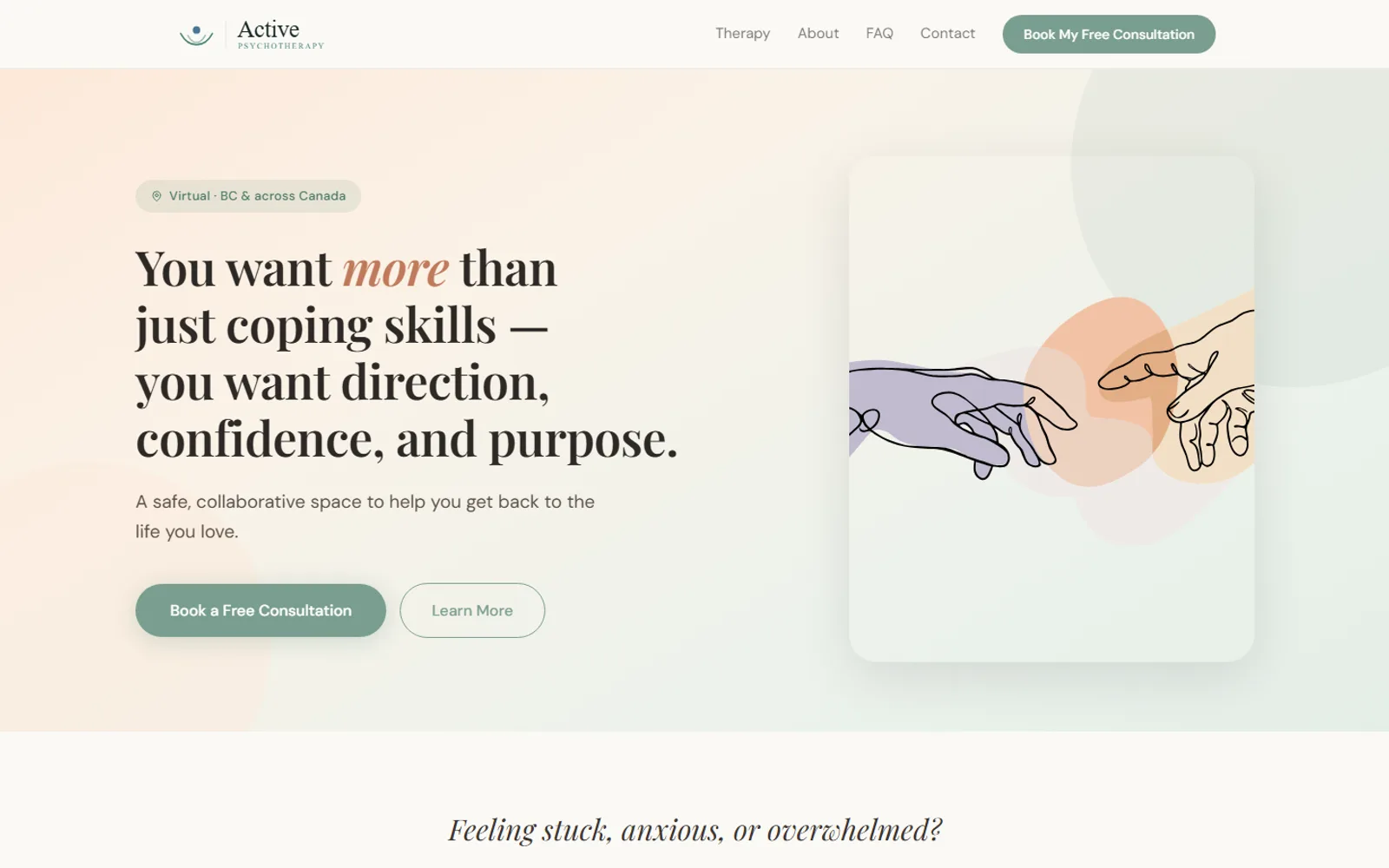
- 1
Trust signals — credentials, verifications, registration — above the fold
- 2
Areas of focus enumerated so clients can find themselves in the list
- 3
Free 15-minute consult as the single, repeated call to action
- 4
How-It-Works pathway lowers the cost of reaching out
S5
UX Strategy · Working with the Client
The redesign was mostly conversations.
The biggest design work on this project wasn’t visual — it was editorial. Frazer had far more to offer than his site admitted: more credentials, more areas of focus, more proof. Over working sessions we inventoried all of it, and I made the case, item by item, for putting it on the page.
In most industries that’s marketing. In therapy it’s something closer to care: a prospective client is anxious, comparing strangers, and looking for a reason to feel safe. Every credential surfaced and every question answered in advance removes one more reason to close the tab.
If a first session takes courage, the website’s job is to lower the cost of that courage.
What moved from “existing” to “on the page”
Credentials & registration
RCC designation and BCACC membership, stated plainly and placed where a visitor is deciding — not on a buried about page.
Verification badges
Psychology Today and Lumino Health verifications brought onto the site, so the trust he’d earned on directories transfers to his own domain.
Areas of focus, in full
Anxiety, self-esteem, life transitions, dating, academic and career pressure, depression — the complete list, so clients can find themselves in it.
Transparent pricing
$145 per 50-minute session, stated up front. Surprises erode trust faster than price does.
Crisis resources
Emergency contacts for Canadian mental-health services — a page a therapy site should never make someone hunt for.
The free consult
A 15-minute, no-commitment call as the single conversion goal the whole site funnels toward.
S6
Key Decisions
Four decisions carried the redesign.
Trust architecture
Credentials, verifications, and crisis resources are placed at decision moments — beside the consult CTA, above the fold — not stored on an about page the anxious visitor never reaches.
A visible path in
Reach out → free 15-minute consult → begin therapy. Making the pathway explicit turns an intimidating unknown into three small steps, and gives the whole site a single conversion goal.
Transparent pricing
$145 for a 50-minute session, stated plainly on the services page. Hiding the number signals there’s something to brace for; showing it says the practice has nothing to hide.
Calm as a design language
Sage and sky palette, generous whitespace, illustration instead of stock photography. The site now makes the same first impression Frazer does — before a word is read.
S7
The System
A small kit, tuned for calm.
Decision 04, in practice: two typefaces, a sage-led palette, a handful of soft components, and the space, accent and motion rules that hold them together. Everything below is rendered live from the shipped stylesheet — real fonts, real hex values, real hover states — not a screenshot.
Playfair Display · 400 / 600 + italic · display
You want more than just coping skills — you want direction, confidence, and purpose.
DM Sans · 400 / 500 · body
Body copy sits at 18px with relaxed 1.7 leading — larger and looser than a typical marketing site, because an anxious first-time reader shouldn’t have to work for the words.
Palette
- SagePrimary action — buttons, links#7a9e8f
- Deep sageSupporting accents, icons#4e7a6a
- TerracottaEmphasis inside headlines#c07a5a
- InkHeadlines and navigation#2d2926
- Warm grayBody copy#5a5047
- PaperPage background#faf9f6
- Pale sageTinted surfaces, callouts#edf2ec
Components · hover them
Anxiety
Tools for the spiral — and for the quieter worry underneath it.
Pill buttons · 22px card radius · lift on hover
Accents · one per concept
Anxiety
Terracotta marks the entry point — the word most visitors arrive searching for.
#fde8d8 · #c07a5a
Self-esteem
Deep sage carries the steady, evidence-based register.
#d5e8e0 · #4e7a6a
Trauma & depth
Purple keeps the heavier track visually distinct, never a surprise.
#dbd4f5 · #7a6aa0
Life transitions
Sage is the practice’s default voice — the accent that isn’t one.
#edf2ec · #7a9e8f
A section gets one accent, and it lands on the icon chip alone — a soft tint behind a saturated stroke. Body copy never takes an accent colour and the tints never appear at full saturation, which is why four hues read as one system instead of four.
Space & shape
- Container
- 1160px
- Section padding
- 80 / 40px · 96px on feature bands
- Card radius
- 22px
- Chip & field radius
- 14px
- Button radius
- 100px — the one fully round shape
- Card shadow
- 0 2px 18px · 4.6% → 0 12px 40px · 8%
- Body scale
- 18px / 1.7
Motion · two gestures, total
- Hero stagger
- fadeUp .85s · 28px · delays 0 / .17 / .34s
- Scroll reveal
- .7s · 22px · IntersectionObserver
- Card lift
- −4px · shadow bloom · .24s
- Button lift
- −2px · sage glow · .18s
- Reduced motion
- reveals resolve instantly, no transition
Movement paces the reading — it never entertains. The audience arrives anxious, so the booking form has no animation at all.
Breakpoints · two, both structural
≤ 900px
Nav collapses to a drawer · hero headline drops to 34px · split layouts stack · three- and four-up grids halve · the process connectors hide.
≤ 540px
Section padding tightens to 64 / 24px · hero headline drops to 27px · every grid goes single column · a floating consult CTA pins to the viewport.
S8
The Build · Business Case
Premium template pricing, replaced with $0 a month.
The rebuild is a custom Next.js site deployed on Vercel’s free tier. It costs the practice effectively nothing to run, loads fast, and — unlike the template — gives search engines a real structure to index.
| Squarespace (before) | Next.js on Vercel (after) | |
|---|---|---|
| Monthly cost | Premium Squarespace plan | ~$0 — Vercel free tier |
| Design ceiling | Template constraints | Fully custom Next.js build |
| Search visibility | Generic structure, weak SEO control | Semantic pages, metadata, local-search foundation |
| Performance | Template weight | Static-first rendering, fast on mobile |
| Ownership | Locked to the platform | Portable codebase the practice owns |
S9
The Outcome
Live today — measured tomorrow.
The rebuild is live on activepsychotherapy.ca. Try it below — it’s the real site, not a mockup. With the domain switch complete, the Squarespace analytics become the baseline; consult inquiries and search traffic from here tell the rest of the story.
Trust is on the page
Credentials, verifications, and the full list of focus areas are finally where clients decide — above the fold, on his own domain.
The site sounds like him
Warm, direct, and clear — the first impression now matches the person clients meet in a session.
The subscription is retired
Premium Squarespace pricing replaced by a free-tier stack the practice owns outright.
A foundation for search
Semantic structure and real metadata mean the practice can start earning local search traffic instead of renting visibility from a directory.
Next Project
TCG Live Prices · Holo Holdings→